Veterans Community Project Brand Identity
Challenge
Develop a logo for Veterans Community Project (VCP), a non-profit dedicated to serving homeless veterans in the Kansas City area.
Develop a logo for Veterans Community Project (VCP), a non-profit dedicated to serving homeless veterans in the Kansas City area.
Solution
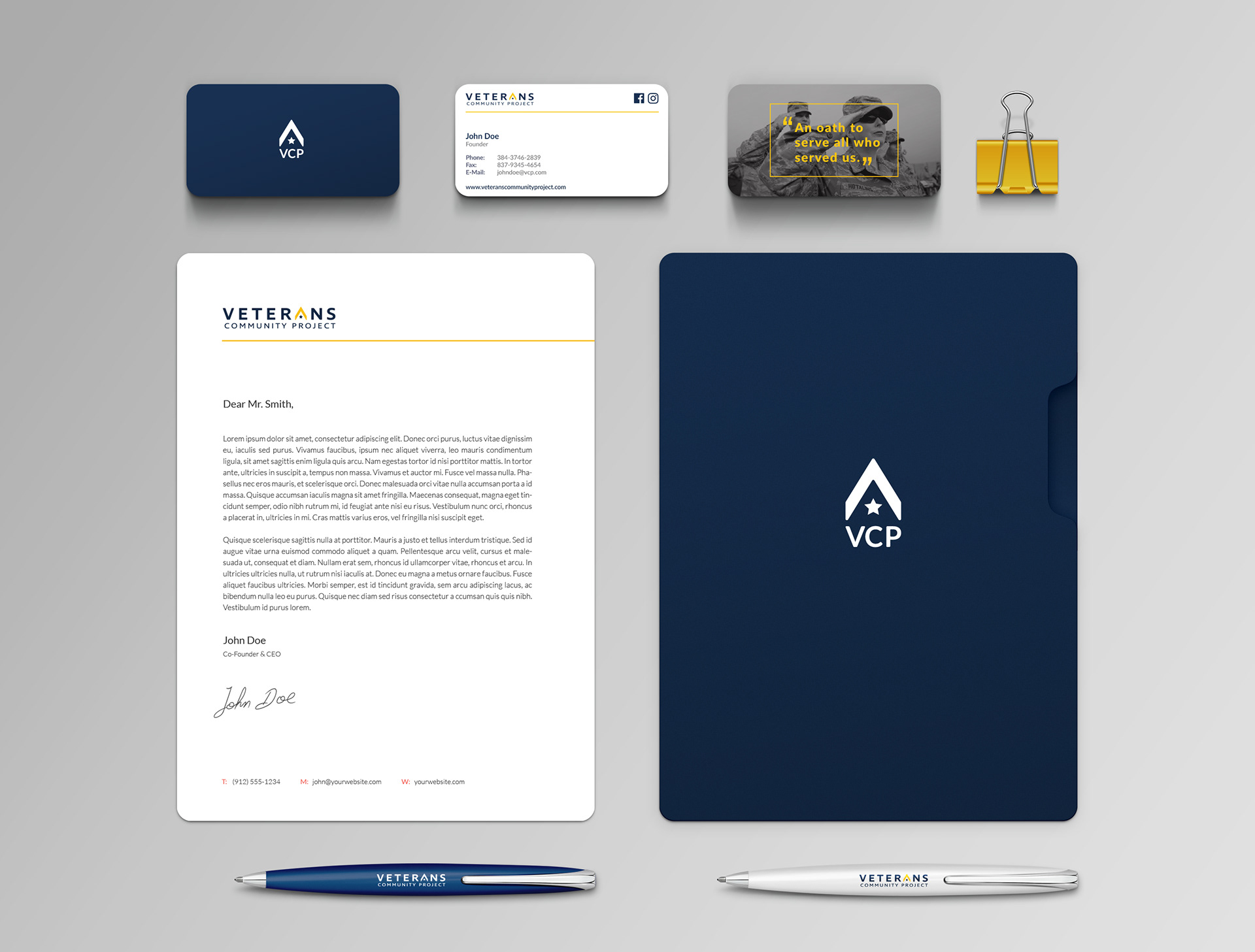
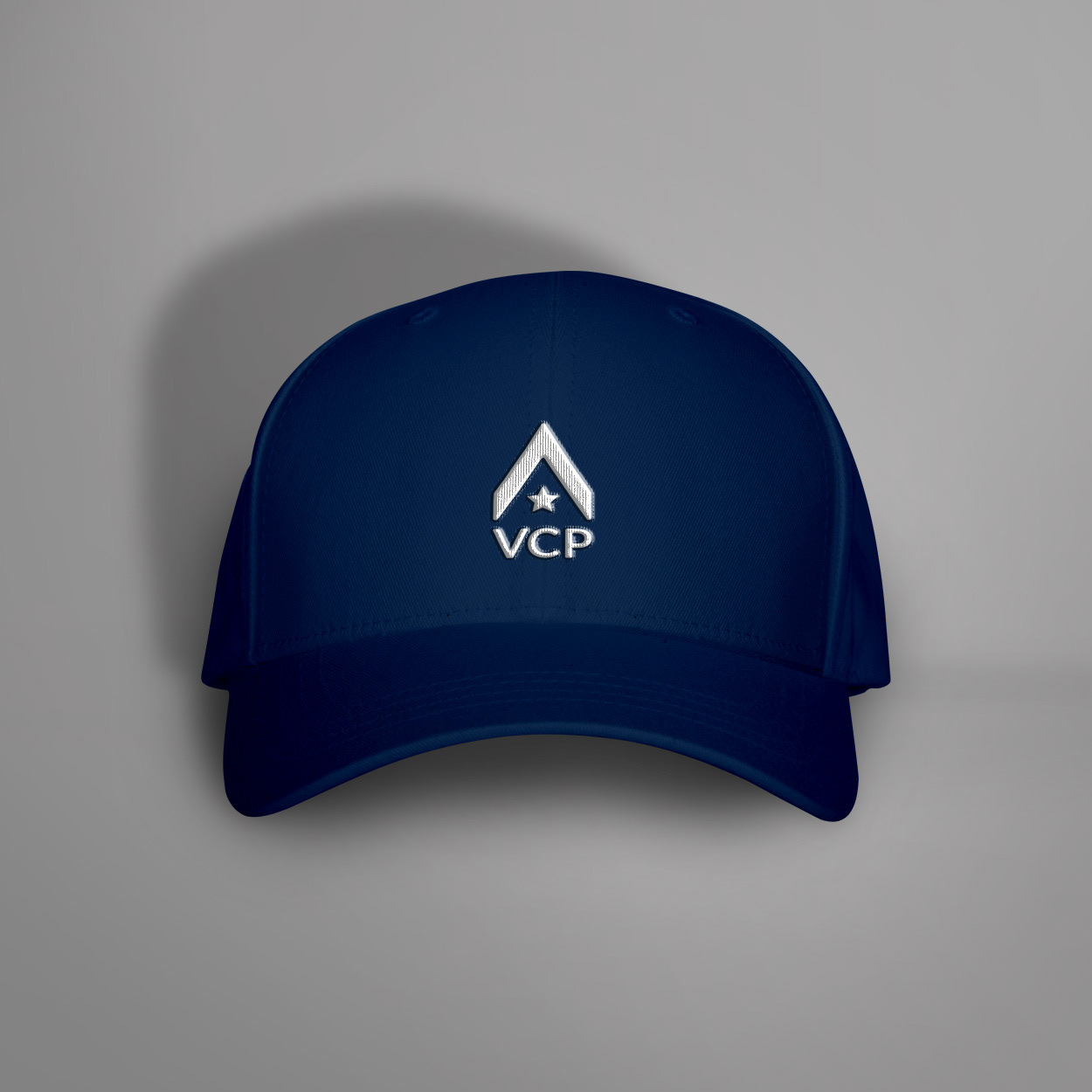
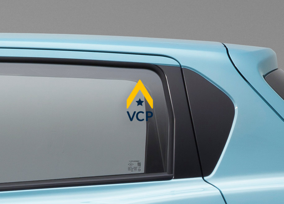
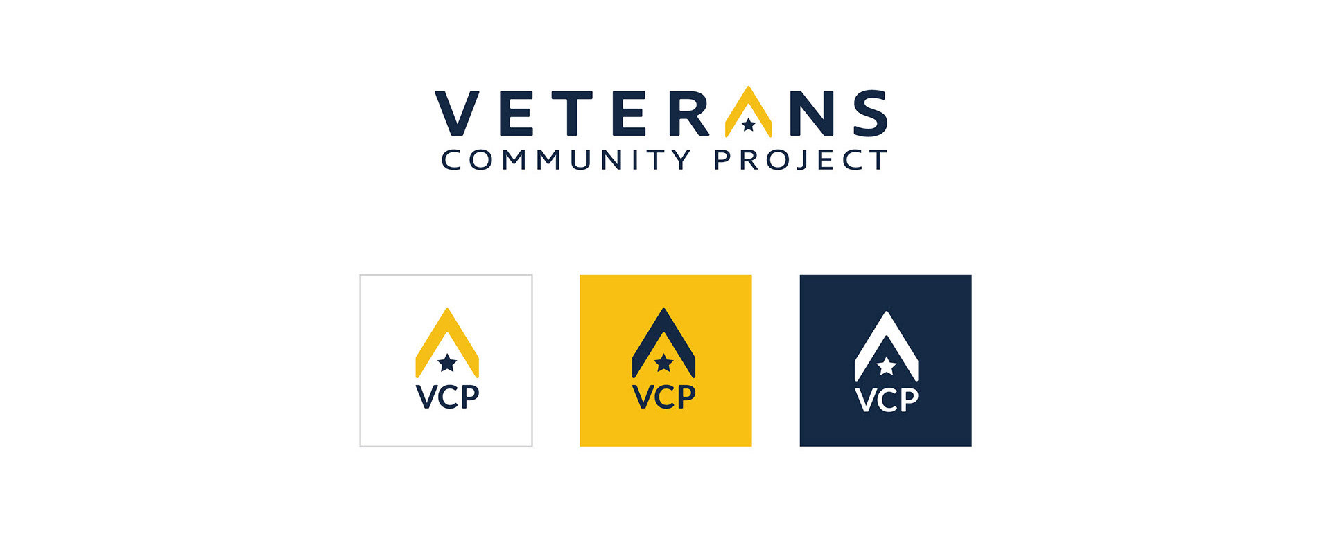
The logo was based on three core values that made up VCP: the veteran, the community, and the home. The "A" in "veterans" serves double duty by sheltering a star and acting as the logomark for the brand. Gold and blue primary colors tie to the military without being overly patriotic and allows the brand to stand apart from other non-profits focusing on service to veterans.
The logo was based on three core values that made up VCP: the veteran, the community, and the home. The "A" in "veterans" serves double duty by sheltering a star and acting as the logomark for the brand. Gold and blue primary colors tie to the military without being overly patriotic and allows the brand to stand apart from other non-profits focusing on service to veterans.
Results
A logo that has been in use for six years and reached millions of viewers when one of the organization's cofounders was featured in season 4, episode 7 of Queer Eye on Netflix.
A logo that has been in use for six years and reached millions of viewers when one of the organization's cofounders was featured in season 4, episode 7 of Queer Eye on Netflix.